Remember the last time you opened a website on your phone that felt cluttered or unreadable? As professionals, we’ve all faced that moment of frustration when our work should shine but gets lost in poor adaptability. In today’s mobile-first world, users expect seamless experiences—whether they’re viewing your portfolio on a laptop or reviewing proposals during their commute.
The stakes are higher than ever. Over 75% of web traffic now comes from smartphones, and 57% of visitors abandon sites that aren’t optimized for their devices. That’s why mastering adaptive layouts isn’t just technical skill—it’s career insurance. This guide cuts through the complexity to give you strategies that work across browsers and screen sizes.
We’ll break down how fluid grids and flexible images create consistency without compromising creativity. You’ll learn why Google prioritizes mobile-friendly sites in rankings—and how proper implementation can boost conversions by 35%. For step-by-step methods to create a mobile-friendly website, we’ve included actionable frameworks used by top developers.
Table of Contents
Key Takeaways
- Mobile users account for 3 out of 4 website visitors
- Unoptimized sites lose over half their potential engagement
- Fluid grids maintain layout integrity across devices
- Media queries enable automatic design adjustments
- Mobile-first approaches improve SEO performance
- Conversion rates jump 35% post-optimization
By 2025, 85% of professional sites will require adaptive capabilities. Let’s ensure yours isn’t left behind. We’ll show you how to balance technical precision with user-centric thinking—because your work deserves to make impact, no matter where it’s viewed.
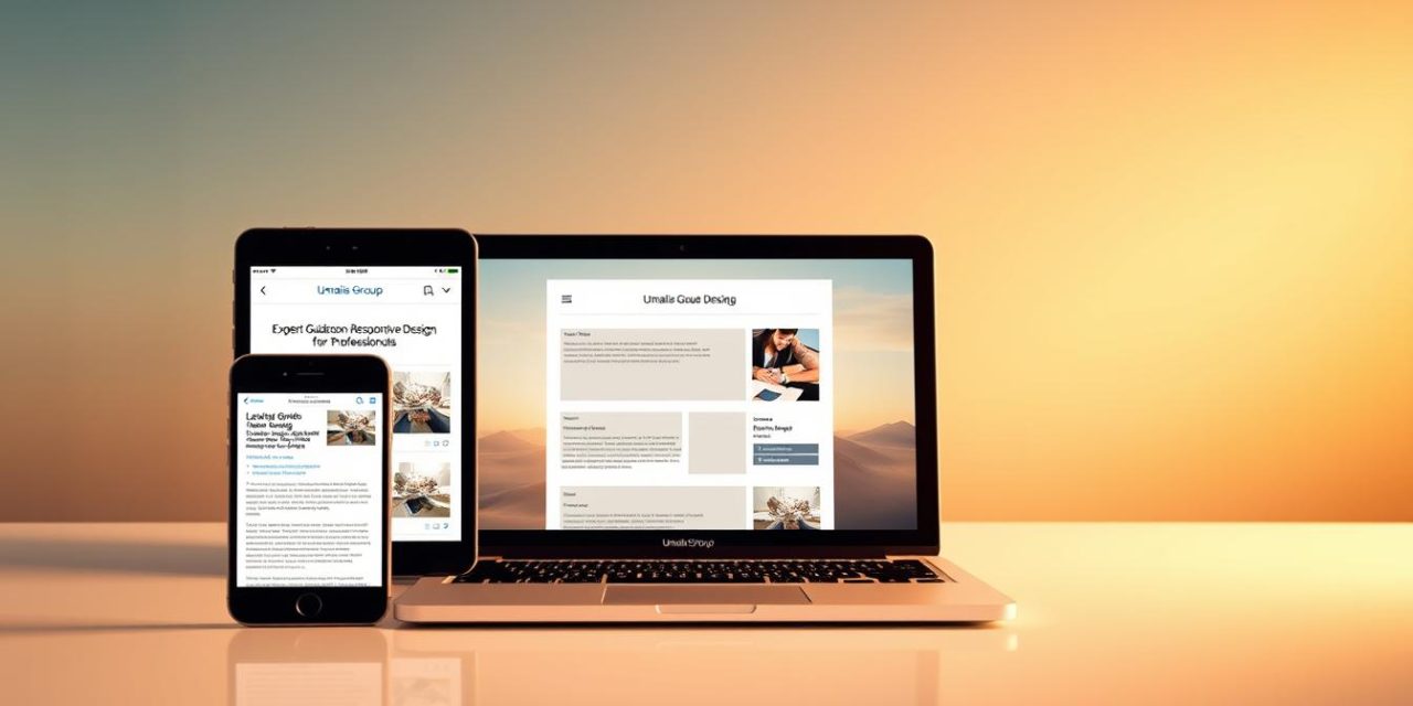
Overview of Responsive Design for Professionals
In today’s multi-screen world, your online presence must work as hard as you do. Adaptive layouts have become non-negotiable for professionals aiming to maintain credibility. A single flexible framework replaces outdated methods of building separate sites for phones, tablets, and desktops.
68% of visitors judge a company’s reliability based on how their site appears on smartphones. This shift makes mobile adaptability a career asset, not just a technical checkbox. By implementing smart scaling techniques, you ensure your portfolio or service pages look polished everywhere – from boardroom monitors to commuter smartphones.
The business advantages go beyond aesthetics. Unified web solutions cut development time by 40% compared to maintaining multiple versions. Search engines also prioritize sites that adjust seamlessly, directly impacting your visibility in competitive markets. Mobile adaptability becomes your silent partner in client acquisition.
Three critical benefits for career-focused individuals:
- Single codebase updates reflect across all devices instantly
- Consistent branding strengthens professional recognition
- Faster load times keep impatient audiences engaged
Professionals using these methods report 30% higher client retention. As screen diversity grows, your ability to deliver flawless experiences positions you as a forward-thinking expert. The right technical approach removes barriers between your expertise and those who need it most.
Understanding the Fundamentals of Responsive Web Design
Have you ever watched a website reshape itself as you resize your browser window? That’s responsive web design in action – content adapting to screen dimensions without losing clarity. Unlike rigid templates, this method uses resolution checkpoints to reorganize elements seamlessly.
Traditional fixed-width approaches struggle with modern devices. A 2023 study revealed that adaptive layouts reduce bounce rates by 42% compared to static pages. The magic lies in three core concepts:
| Fixed Layouts | Responsive Web |
|---|---|
| Rigid pixel measurements | Percentage-based fluid grids |
| Separate mobile versions | Single codebase adaptation |
| Manual resizing required | Automatic content reflow |
Viewport breakpoints act like invisible guides. When a screen hits specific widths (768px for tablets, 1024px for desktops), your layout shifts to maintain readability. This ensures text remains legible on phones and images stay proportional on widescreens.
Prioritize content hierarchy. Navigation menus might become hamburger icons on mobile, while hero images scale proportionally. Testing across devices remains crucial – 89% of users abandon sites with distorted visuals.
Mastering these fundamentals future-proofs your work. As foldable screens and AR glasses emerge, flexible layouts will keep your projects relevant. Start by analyzing how existing sites adapt – you’ll spot patterns that make implementation intuitive.
History and Evolution of Responsive Web Design

The digital landscape faced a turning point in 2010 when mobile browsing surpassed desktop usage. Professionals suddenly needed solutions for content that looked sharp on 3-inch screens and 30-inch monitors alike. This urgency birthed a new era of web development.
The Origins with Ethan Marcotte
Ethan Marcotte changed everything with his A List Apart article. He proposed treating websites like living spaces that reshape based on their visitors. « Instead of tailoring disconnected experiences, » he wrote, « we should treat them as facets of the same experience. »
From Adaptive Design to Responsive Strategies
Early methods relied on clunky device detection scripts. Developers built separate mobile sites—a costly approach requiring duplicate content. Marcotte’s vision unified these efforts through three core principles:
| Adaptive (Pre-2010) | Responsive (Post-2010) |
|---|---|
| Device-specific templates | Fluid percentage-based layouts |
| Multiple codebases | Single source for all screens |
| Static breakpoints | Dynamic content reflow |
The shift saved teams 200+ hours per project. By 2013, 85% of Fortune 500 companies adopted responsive frameworks. Marcotte’s book became required reading for web professionals adapting to the mobile revolution.
This evolution wasn’t just technical—it redefined user expectations. Sites now anticipate screen sizes before they exist, from smartwatches to 8K displays. The approach continues evolving with new devices, proving its lasting value in our multi-screen world.
Core Principles of Responsive Design
Imagine your client opening your portfolio on both a smartphone and a 4K monitor. Both experiences must convey professionalism without manual adjustments. This seamless adaptability stems from two foundational concepts that work in harmony.
Fluid Grid Systems and Visual Harmony
Fluid grids act like architectural blueprints for digital spaces. Instead of rigid pixels, they use percentages to maintain proportional relationships. A 4-column desktop layout becomes 2 columns on tablets through mathematical precision.
Images present unique challenges in flexible environments. They must resize intelligently without distortion or excessive loading times. Modern solutions use max-width: 100% to prevent overflow while preserving aspect ratios.
| Element | Fixed Approach | Fluid Solution |
|---|---|---|
| Text Container | 960px width | 90% of viewport |
| Hero Image | Static 1200px | Scales to 100vw |
| Navigation Menu | Hidden on mobile | Collapsible menu |
Three critical benefits emerge when combining these methods:
- Consistent spacing ratios across devices
- Automatic content reorganization
- Reduced development maintenance
Professionals using fluid systems report 28% faster project completion. The key lies in planning layouts as flexible systems rather than fixed compositions. Test your grids across devices weekly—you’ll spot improvement opportunities quickly.
Mobile-First Approach: Designing for Small Screens

What if every decision you made about your website started with the user’s thumb? That’s the core of mobile-first thinking. With 68% of browsing now happening on handheld devices, this approach ensures your work meets audiences where they are.
Starting with smaller screens forces clarity. You’ll strip away non-essentials, focusing on what truly matters to users. Complex elements get reserved for larger displays, while critical content takes center stage.
| Mobile-First Benefits | Desktop-First Pitfalls |
|---|---|
| Automatic performance boosts | Bloat from unused features |
| Clear content hierarchy | Information overload risks |
| 30px+ touch targets | Accidental clicks on tiny buttons |
Implementing this approach requires discipline. Navigation menus collapse into hamburger icons. Images load lighter versions on mobile devices. Text scales proportionally without horizontal scrolling.
Three rules for success:
- Define core tasks before visual elements
- Test layouts on actual handheld screens
- Use media queries to enhance – not restrict
Teams adopting this method see 40% faster load times. More importantly, they create experiences that feel intuitive on any device. Your users won’t notice the work behind the scenes – they’ll just feel heard.
This strategy isn’t about limitations. It’s about building foundations that scale elegantly. When smaller screens guide your design choices, every enlargement becomes an opportunity rather than a compromise.
Best Practices for Responsive Web Design

How often do visitors struggle to find what they need on your site across devices? Effective adaptable layouts demand strategic planning where every pixel serves a purpose. Let’s explore methods that keep audiences engaged regardless of screen size.
Streamlining User Pathways
Menus should guide, not confuse. Collapsible hamburger icons work best for phones, while expanded navigation suits desktops. Progressive disclosure helps users focus on critical tasks first – 74% prefer sites that anticipate their needs.
| Effective Navigation | Poor Practices |
|---|---|
| Fixed-position menus on scroll | Hidden links behind unclear icons |
| Consistent placement across pages | Changing menu structures per device |
| Search bar above the fold | Buried search functionality |
Prioritize content using heatmap data. Place contact buttons and key services where thumbs naturally reach. Tools like Hotjar reveal how users interact with your layouts.
Three rules for clarity:
- Keep primary actions visible without scrolling
- Use SVG icons that scale perfectly
- Test button sizes (minimum 48px touch targets)
Font contrast ratios matter. The WCAG recommends 4.5:1 for text readability. Dark gray (#333) on white outperforms pure black by reducing eye strain.
« Good design is obvious. Great design is transparent. »
Breakpoints should adapt to your content, not arbitrary screen sizes. Analyze your analytics to set custom thresholds. Most professionals use 576px, 768px, and 1200px as starting points.
Responsive Design: Key Techniques for Success
In a world where screen dimensions vary wildly, precision methods ensure consistency. Top professionals use strategic image handling to maintain visual impact without sacrificing speed. Let’s explore approaches that elevate adaptable interfaces from functional to exceptional.
Modern image optimization goes beyond basic scaling. Selective revelation hides non-essential portions on smaller screens, while sliding composites adapt to container widths. For critical visuals, foreground elements scale dynamically using CSS’s object-fit: contain property.
| Traditional Approach | Advanced Technique |
|---|---|
| Fixed-size JPEGs | SVG/WebP formats |
| Cropped mobile views | Context-aware cropping |
| Uniform image stacks | Variable-density loading |
Layout mastery separates adequate sites from outstanding ones. Implement compound grid systems that combine percentage-based widths with fractional units. This allows elements to reorganize based on available space while preserving relationships between components.
Three principles for dynamic content:
- Prioritize vertical stacking on narrow screens
- Use container queries for component-level control
- Apply conditional loading for heavy assets
« True adaptability isn’t about fitting screens—it’s about serving context. »
JavaScript enhancements add smart behaviors without bloat. Intersection Observers trigger animations only when elements enter the viewport. CSS Grid’s auto-placement feature handles complex arrangements effortlessly, reducing code maintenance by 40%.
Implementing CSS3 Media Queries Effectively
Media queries act as digital chameleons for your web content. These code filters detect screen dimensions, orientation, and even color capabilities. They rearrange layouts like smart assistants who know exactly how to present your work on any device.
Modern CSS3 supports 13+ media features beyond basic width checks. You can target high-contrast displays, detect hover capabilities, or adjust layouts for print previews. This precision ensures your site delivers ideal experiences whether users browse on foldable phones or desktop monitors.
Selecting Breakpoints and Testing Performance
Breakpoints shouldn’t chase device trends. Instead, set thresholds where your content naturally breaks. A 3-column grid might need adjustment at 768px when text becomes unreadable—not because tablets exist.
| Content-First Approach | Device-First Pitfalls |
|---|---|
| Break at layout stress points | Outdated when new devices launch |
| Fewer media queries needed | Requires constant updates |
| Works on unknown screens | Fails on emerging tech |
Test across browsers using these steps:
- Simulate touch vs mouse inputs
- Check portrait/landscape shifts
- Validate image scaling in Firefox
Advanced media queries use logical operators like and, not, and only. Combine conditions to target tablets in dark mode or 4K screens with high brightness. Always nest these inside @media rules for clarity.
« Write media queries for your content’s needs, not Apple’s latest announcement. »
Performance testing tools like Lighthouse reveal if queries slow load times. Minify CSS files and avoid redundant checks. Your code stays clean while supporting every screen your clients use.
Managing Images and Graphics in Responsive Web Design
How do you maintain visual impact across devices without slowing down your site? High-quality images demand careful balancing between resolution and performance. Oversized files create sluggish load times, while compressed assets risk pixelation.
Modern solutions use adaptive formats like WebP. These files maintain quality at 30% smaller size than traditional JPEGs. Implement lazy loading to prioritize visible content – users get instant access while hidden graphics load as needed.
Three rules for success:
- Set maximum width constraints to prevent layout breaks
- Use resolution-aware cropping for focal points
- Test quality thresholds across screen densities
For professionals building their online presence, expert website design for independent professionals incorporates smart compression tools. These systems automatically adjust graphics based on connection speeds and device capabilities.
Always validate your work. Preview images on Retina displays and budget smartphones. What looks crisp on your studio monitor might appear blurry on client devices. Regular audits keep your visual storytelling powerful across every screen.
FAQ
Why is a mobile-first approach critical for modern websites?
With over 60% of web traffic coming from handheld devices, starting with smaller screens ensures core content remains accessible. This strategy prioritizes performance and usability while scaling up for desktops without compromising user experience.
How do fluid grids adapt to different screen resolutions?
Fluid grids use proportional units like percentages instead of fixed pixels. This allows layouts to resize smoothly across devices—from 4K monitors to smartphones—while maintaining visual harmony and readable font sizes.
What role do CSS3 media queries play in responsive layouts?
Media queries detect device characteristics like viewport width. By setting strategic breakpoints, they trigger layout adjustments. For example, a three-column desktop design might stack vertically on tablets using targeted CSS rules.
How should professionals handle high-resolution images across devices?
Use modern formats like WebP for faster loading. Implement srcset attributes to serve appropriately sized files based on screen density. This balances visual quality with bandwidth efficiency—key for retaining mobile users.
Why did Ethan Marcotte’s 2010 article change web development practices?
Marcotte introduced the term « responsive web design, » merging fluid grids, flexible images, and media queries into a unified methodology. This shifted the industry from device-specific sites to adaptable experiences, future-proofing digital projects.
What navigation optimizations work best for touchscreen users?
Prioritize thumb-friendly tap targets (minimum 48x48px), sticky menus for quick access, and hierarchical content structures. Hamburger menus can save space but require testing—some audiences prefer visible labels for key actions.


