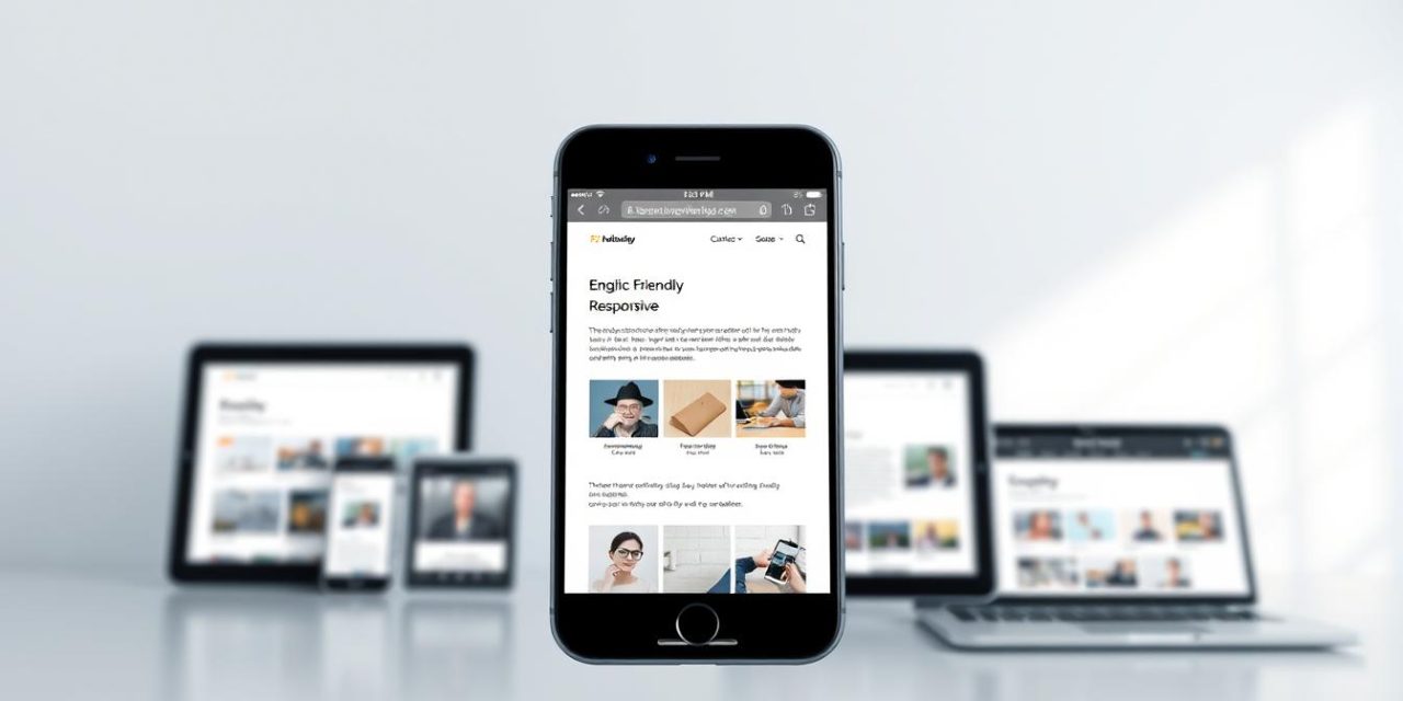
The digital world has undergone a dramatic transformation. As of early 2025, over 62% of all global web traffic comes from smartphones. When you add tablet usage, that number climbs even higher.
This fundamental shift means your website must cater to a vast audience on the go. A positive user experience is no longer confined to the desktop screen. It happens everywhere.
This is where the principle of responsive design becomes essential. It ensures your site looks and works perfectly on any device. Failing to adapt can lead to frustrated visitors and lost opportunities.
This guide will explore how to build a site that delivers a consistent, high-quality experience for all users. We will cover the core principles of creating and testing adaptable layouts.
Table of Contents
Key Takeaways
- Non-desktop devices now generate the majority of global web traffic.
- A positive user experience is directly tied to how well a website adapts to different screens.
- Mobile responsiveness is a fundamental requirement, not an optional feature, for modern websites.
- Ignoring this design approach can negatively impact engagement and conversion rates.
- Implementing a flexible layout is crucial for maintaining a competitive online presence.
Introduction: The Growing Role of Mobile Devices
The primary gateway to the internet has shifted decisively over the past decade. User behavior has transformed from scheduled desktop sessions to constant, on-the-go access.
Current data confirms this trend. As of January 2025, smartphones alone command 62.71% of global web traffic. When combined with tablets, approximately 65% of all internet users access websites from non-desktop devices.
This shift creates new expectations. People using these devices often have shorter attention spans. They prefer content that loads quickly and fits into brief moments of time.
For businesses and developers, this means the experience on smaller screens is no longer secondary. It is central to reaching an audience effectively. Understanding this growth is essential for smart design choices.
This trend shows no signs of slowing. Adopting a strategy focused on mobile optimization best practices is an ongoing priority for success.
What is Mobile Responsiveness?
Modern web architecture demands a fluid approach to content presentation across platforms. A responsive website automatically adjusts its layout and elements based on the device accessing it.
This adaptive design goes beyond simple scaling. It involves intelligent restructuring of content for optimal viewing on various screen sizes.

The technical foundation relies on CSS media queries, flexible grids, and HTML5. These technologies detect device characteristics and adjust presentation accordingly.
| Feature | Responsive Design | Fixed Design |
|---|---|---|
| Layout Adaptation | Fluid grids adjust automatically | Fixed pixel dimensions |
| Content Reorganization | Dynamic stacking and prioritization | Static positioning |
| Device Compatibility | Works across all screen sizes | Optimized for specific devices |
True responsive design considers touch interactions and loading performance. It maintains a single codebase while serving all users effectively.
Navigation menus convert to compact icons on smaller displays. Multi-column layouts stack vertically for better readability.
This approach ensures consistent user experience regardless of the viewing device. It represents the modern standard for web development.
Responsive Web Design Fundamentals
Effective web development today centers on creating layouts that fluidly adjust to user devices. The core principle involves using flexible grids and relative units instead of fixed measurements.
This approach allows content to resize proportionally across various displays. CSS media queries detect device characteristics and apply appropriate styling rules.
Comparing Desktop and Mobile Layouts
Desktop designs typically feature multiple columns and extensive navigation systems. They utilize horizontal space efficiently with complex menu structures.
Smaller screen layouts prioritize single-column scrolling and simplified interfaces. Content stacks vertically to maintain readability on compact displays.
| Layout Feature | Desktop Design | Mobile Layout |
|---|---|---|
| Column Structure | Multiple columns side-by-side | Single column stacking |
| Navigation Style | Horizontal menu bars | Hamburger menus or bottom bars |
| Content Priority | Spread across wide canvas | Vertical hierarchy with top priority |
| Interactive Elements | Hover states and detailed menus | Touch-optimized buttons and gestures |
Breakpoints define specific widths where layout changes occur. Designers set these points based on common device sizes and user behavior patterns.
Successful implementation requires planning for multiple layouts from the project’s beginning. This ensures optimal experiences across all viewing contexts.
Key Benefits of a Mobile Responsive Website
The strategic value of device-agnostic design extends far beyond basic compatibility. When your website adapts flawlessly to any screen, you create a consistent positive experience for all users. This fundamental adaptability prevents alienating the 65% of web traffic coming from non-desktop devices.

Visitors immediately notice when a site works properly on their device. This user experience improvement directly lowers bounce rates as people stay longer on well-formatted pages. Search engines reward this adaptability with better rankings, making mobile responsiveness an SEO necessity.
Maintaining one adaptable site proves more cost-effective than separate desktop and mobile versions. This unified approach simplifies updates while ensuring consistent messaging across all platforms.
Conversion rates naturally increase when visitors can complete actions easily on any device. Businesses gain competitive advantage by capturing market share from less-adapted rivals. The flexible nature of responsive design also future-proofs your investment against new device formats.
Ultimately, a positive experience builds trust and brand credibility. Poor performance on handheld devices drives users toward competitors who prioritize their browsing needs.
Essential Features for Mobile Responsive Sites
Essential characteristics of adaptable web layouts center on intuitive navigation and readable content. These elements work together to create a seamless browsing experience across different screen sizes.
Optimizing Readability and Touch Elements
Text must be easily readable without zooming. Use a minimum 16px font size for body content. Proper spacing and contrast prevent eye strain.
Interactive elements require careful sizing. Buttons should be at least 44×44 pixels for comfortable tapping. Clear visual cues help users identify clickable areas.
Content must adapt to both portrait and landscape orientations. Layouts should rearrange smoothly without hiding important information. This flexibility enhances the overall user experience.
Lightweight design is crucial for handheld devices. Optimized images and efficient code ensure fast loading times. Users appreciate quick access to content.
Prioritize essential information prominently. Secondary content can be collapsed or moved lower. This approach aligns with effective optimization strategies for different screen sizes.
Choose readable font families with proper sizing hierarchies. Ensure sufficient color contrast for various lighting conditions. These typography choices improve content accessibility.
Simplify forms with appropriate keyboard types. Reduce required fields to minimize user friction. Every element should feel natural on smaller screens.
Implementation Techniques: Media Queries & Viewport Settings
Behind every flexible website lies a foundation of precise coding techniques. These tools enable layouts to adapt intelligently across different viewing environments.

Setting the Viewport Meta Tag
The viewport meta tag is essential for proper rendering. Include this code in every page head section:
<meta name="viewport" content="width=device-width, initial-scale=1.0">
This instructs browsers to match the page width to the device screen. The initial-scale setting controls the starting zoom level.
Utilizing Media Queries Effectively
Media queries are conditional CSS statements that apply styles based on device characteristics. They detect screen width, height, and orientation.
For example, this query adjusts layout for tablets:
@media screen and (max-width: 800px) { .column { width: 100%; } }
Another example targets phones with max-width: 480px. These media queries help create responsive designs that transform gracefully.
Testing with browser tools ensures your web implementation works correctly. This approach guarantees consistent responsiveness across all devices.
User-Centric Design Principles for Mobile
The way people engage with content on smaller screens differs fundamentally from traditional computer usage patterns. Understanding these behavioral differences is crucial for creating effective handheld experiences.
Handheld device users typically operate in brief, focused sessions. They seek immediate answers rather than exploratory browsing. This task-oriented approach demands streamlined interfaces.
Understanding Mobile User Behavior
People interacting with portable screens exhibit distinct psychological patterns. Their attention spans are shorter, and tolerance for delays is significantly lower. A slow-loading page can cause immediate abandonment.
The « thumb zone » concept recognizes how users naturally hold their devices. Interactive elements should prioritize the center and bottom areas where thumbs reach comfortably. Top corners require awkward hand repositioning.
« Great handheld design begins with empathy for the user’s context and constraints. »
Environmental factors heavily influence the handheld experience. People browse while commuting, waiting, or multitasking. Designs must accommodate interruptions and quick resumption.
| Behavior Aspect | Handheld Users | Desktop Users |
|---|---|---|
| Session Duration | Brief, frequent intervals | Longer, focused periods |
| Patience Threshold | 2-3 second load tolerance | More willing to wait |
| Interaction Style | Thumb-focused, touch-based | Mouse precision, hover states |
| Content Preference | Scannable, immediate value | Detailed, exploratory content |
Each user expects content to adapt to their current context. Designing for these behavioral realities creates more satisfying experiences. It reduces frustration and increases engagement.
Considering the limited time available during handheld sessions, information hierarchy becomes critical. Clear visual organization helps users find what they need quickly. This approach respects their busy lifestyles.
Mobile Responsiveness Best Practices
Creating websites that perform well across all screen sizes involves mastering a set of fundamental guidelines. These best practices help ensure website quality remains consistent across diverse viewing environments.

Content readability forms the foundation of good design. Use font sizes of at least 16px for body text with line heights of 1.5 or greater. Maintain sufficient color contrast ratios to ensure website content remains legible without zooming.
Compact, prioritized layouts highlight essential content prominently. Remove decorative elements that consume valuable screen space without adding functional value. This approach supports effective mobile responsiveness.
Touch-friendly interfaces require minimum target sizes of 44×44 pixels. Provide adequate spacing between interactive elements to prevent accidental taps. Position key actions within comfortable thumb reach for one-handed use.
Image optimization techniques maintain visual quality across devices. Use responsive images with appropriate file formats like WebP for photos and SVG for icons. Implement lazy loading to improve performance.
Minimalistic design principles reduce visual clutter through simplified layouts. Employ ample white space and progressive information disclosure. This enhances overall responsiveness and user satisfaction.
Continuous testing represents critical best practices for maintaining quality. Regular reviews with real users identify issues that simulators might miss. This ongoing process helps sustain optimal mobile responsiveness over time.
Following these best practices ensures your site delivers excellent performance across all devices. Proper implementation supports strong responsiveness and positive user experiences.
Testing Tools and Methods for Responsive Websites
Comprehensive testing represents the final checkpoint before launching any adaptable website. Even the most carefully designed layouts can display unexpected issues on actual devices.
Thorough validation ensures your site delivers consistent quality across diverse viewing environments. This process identifies rendering problems before they affect real users.
Browser-Based Responsive Checkers
Built-in developer tools offer convenient simulation capabilities. Chrome DevTools and Firefox Responsive Design Mode let you test various screen sizes quickly.
These tools simulate device dimensions, orientations, and pixel densities. They provide immediate feedback during development without requiring physical devices.
Dedicated platforms like BrowserStack expand testing possibilities. They offer access to thousands of real browser and device combinations for interactive validation.
| Testing Method | Advantages | Limitations |
|---|---|---|
| Browser DevTools | Free, immediate results during development | Cannot replicate actual device performance |
| Cloud Testing Platforms | Access to real devices and browsers | Subscription costs, internet dependency |
| Physical Device Testing | Accurate performance and touch interaction data | Requires device collection and maintenance |
Real Device Testing Strategies
Physical testing provides the most accurate assessment of website behavior. Maintain a collection of popular devices representing your audience’s preferences.
Include various iPhone models, Samsung Galaxy devices, and budget Android phones. This coverage ensures you catch device-specific rendering quirks.
Create test matrices based on your analytics data. Focus on combinations your actual visitors use most frequently.
Automated visual regression tools can streamline the testing process. They capture screenshots across multiple configurations and highlight differences automatically.
Test throughout development rather than waiting until completion. This iterative approach catches issues early when they’re easier to fix.
Regular retesting maintains quality as new devices and browsers emerge. This ongoing commitment ensures lasting website performance.
Optimizing Responsive Images & Content Delivery
Visual content presents unique challenges in adaptable web layouts. Balancing quality and performance across different screens requires specific techniques. Proper implementation ensures fast loading and sharp appearance on all devices.
Using CSS for Image Scaling and Quality
The CSS max-width property offers a simple solution for basic image adaptation. Setting it to 100% prevents images from exceeding their container size. Combined with height: auto, this maintains proper proportions during scaling.
This approach ensures images scale down for smaller screens without pixelation. They never stretch beyond their original dimensions, preserving visual quality. This method works well for many standard web layouts.
For more advanced control, the HTML picture element provides art direction capabilities. Developers can specify different image files for various screen sizes. This allows serving optimized versions based on device characteristics.
Modern formats like WebP offer better compression than traditional JPEG or PNG files. Using these formats reduces file size while maintaining quality. Always include fallbacks for browsers that don’t support newer formats.
Lazy loading techniques further enhance performance by deferring off-screen image loading. This significantly improves initial page load times, especially important for users with limited bandwidth.
Overcoming Device Fragmentation and Performance Challenges
Device fragmentation creates one of the biggest challenges in contemporary web development. The ecosystem includes thousands of different devices with varying screen sizes, resolutions, and capabilities.
Testing every possible combination among 3500+ device/browser setups is impractical. It would be prohibitively expensive and time-consuming for most teams.
Leveraging Market Data for Device Targeting
The smart solution involves using market data from authoritative sources. Websites like Statista.com provide extensive statistics on device popularity.
This data helps identify which devices represent the majority of your audience. You can create a testing matrix focusing on the most common configurations.
Geographic variations matter significantly. Device market share differs by region, so use localized data for specific countries.
Performance optimization must account for older devices with limited power. Strategies like conditional loading ensure functionality across a wide range of hardware.
Regular review of market data maintains optimal coverage as new devices emerge. This approach ensures your site’s adaptability remains effective over time.
Conclusion
As technology continues to diversify, the demand for universally accessible web experiences intensifies. The principles of responsive design have become fundamental to modern website development.
This guide has covered essential techniques like viewport settings and media queries. These tools help create adaptable layouts that serve all users effectively. Proper implementation ensures a seamless user experience across devices.
Maintaining mobile responsiveness requires ongoing attention. Regular testing and updates keep your website performing optimally. This commitment delivers tangible business benefits.
Investing in adaptable design improves engagement and conversion rates. It also strengthens your competitive position in the market. These advantages make mobile responsiveness essential for long-term success.
The future will bring new device formats and user behaviors. Embracing adaptable design principles prepares your website for these changes. Start implementing these strategies today to build a foundation for lasting digital success.
FAQ
Why is a website that adapts to various screen sizes so important?
A site that adjusts to different screen sizes is vital because it provides a positive experience for all visitors. With so many people using phones and tablets, a design that works on a wide range of devices helps keep bounce rates low and improves search rankings.
What are the fundamental differences between desktop and mobile layouts?
Desktop layouts often have more horizontal space, allowing for multi-column designs. Layouts for smaller screens typically use a single column, larger touch-friendly buttons, and simplified navigation to ensure content is easy to read and interact with on a smaller display.
How do media queries help in creating a responsive web design?
Media queries are a CSS technique that applies different style rules based on the device’s characteristics, like its width. They allow a single website to change its layout, font sizes, and image dimensions automatically to fit everything from a large desktop monitor to a small phone screen.
What are some best practices for optimizing images on a responsive site?
Best practices include using modern image formats like WebP for better compression, setting the `max-width: 100%` property in CSS to prevent images from overflowing their containers, and implementing responsive image syntax (`srcset`) to serve appropriately sized files based on the user’s device, which improves page speed.
Which tools are most effective for testing a site’s design across different devices?
Effective tools include browser-based checkers like Chrome DevTools, which simulate various screen sizes. For the most accurate results, real device testing on actual phones and tablets is crucial. This process helps identify issues that simulators might miss, ensuring a seamless experience.
How can a design team address the challenge of device fragmentation?
Teams can leverage market data from sources like Google Analytics to identify the most common devices used by their audience. This data allows for targeted optimization, focusing efforts on the screen sizes and browsers that represent the largest segment of users, making the development process more efficient.


