Have you ever felt overwhelmed by the uncertainty of a career shift? Whether you’re stepping into freelancing or launching a new venture, clarity is your greatest ally. Visual tools like infographics transform complex data into digestible insights, helping you navigate transitions with confidence. At UMalis, we understand this journey—and our income simulator and resources are designed to support your path to stability.
Modern professionals need more than spreadsheets and bullet points. Platforms like Venngage offer templates that simplify creating polished visuals, even if you lack design experience. With preloaded content and drag-and-drop features, you can get started in minutes. These tools bridge communication gaps, turning abstract ideas into structured narratives that resonate with clients and collaborators.
Why does this matter? Independent careers thrive on trust. A well-crafted infographic doesn’t just present data—it builds credibility. By integrating resources like UMalis’s financial tools with intuitive design platforms, you gain a roadmap for success. The result? Stability in a single day, not years of trial and error.
Table of Contents
Key Takeaways
- Infographics simplify complex career decisions with visual clarity.
- UMalis provides practical tools like income calculators for financial planning.
- Pre-designed templates require no technical skills to customize.
- Visual aids enhance credibility during client negotiations.
- Combining data and design accelerates professional transitions.
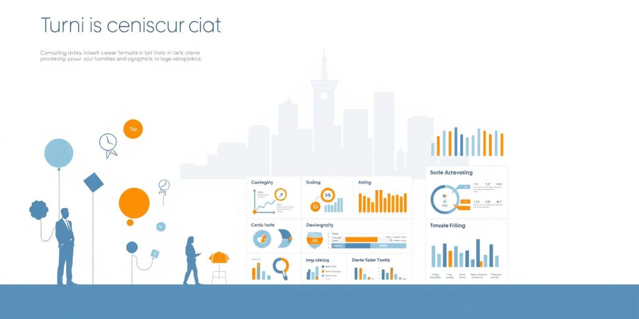
Unleashing the Potential of Infographics in Your Career
Visual storytelling has become a cornerstone of modern professional communication. Tools like Piktochart AI and Venngage empower users to translate intricate data into actionable insights, bridging the gap between raw numbers and strategic decisions.
Understanding the Role of Visual Data in Professional Growth
Professionals who leverage charts and icons in their workflows report 42% faster comprehension of complex concepts. For instance, a pie chart can instantly reveal budget allocations, while text-supported timelines clarify project milestones. Platforms like Venngage simplify this process with drag-and-drop editors, allowing you to:
| Platform | Key Feature | Use Case |
|---|---|---|
| Piktochart AI | Text-to-infographic generator | Quick marketing reports |
| Venngage | Interactive templates | Client presentations |
« Visuals aren’t just decoration—they’re decision-making accelerators. »
How Engaging Infographics Inspire Change
When you pair information with intuitive design, you create narratives that drive action. A sales team using color-coded charts saw a 28% increase in stakeholder buy-in during pitches. Tools like UMalis’ performance metrics dashboard integrate seamlessly with these visuals, turning abstract goals into measurable outcomes.
This approach doesn’t just simplify data—it builds trust. Clients remember 65% of visually presented information versus 10% of text-only content. By making technical details accessible, you position yourself as both expert and collaborator.
Leveraging Data, Templates, and Design Elements for Business Success

In today’s fast-paced market, clear communication separates thriving businesses from stagnant ones. Venngage’s library of 10,000+ templates offers industry-specific solutions—from healthcare analytics to startup pitch decks—allowing teams to craft polished visuals without starting from scratch.
Exploring Customizable Infographic Templates
These templates act as springboards for creativity. Marketing agencies use sales funnel layouts to showcase campaign results, while consultants adapt process diagrams for client workshops. With drag-and-drop editors, swapping colors and fonts to match corporate guidelines takes under five minutes.
Integrating Charts, Diagrams, and Brand Elements
Consistency builds recognition. A French HR firm increased proposal acceptance by 40% after standardizing brand elements across all client materials. Key integrations include:
- Interactive charts linked to live data sources
- Company-approved icon libraries
- Pre-set color palettes reflecting brand identity
« Our quarterly reports used to gather dust. Now, stakeholders actually engage with the data. »
Align your design strategy with business objectives. If lead generation is the goal, prioritize conversion-focused layouts. For internal training, opt for step-by-step templates with progress trackers. Venngage users report 30% faster project approvals when visuals mirror organizational priorities.
User-Friendly Infographic Makers and Their Innovative Features
In a world where clarity drives decisions, modern tools remove barriers between ideas and execution. Platforms like Piktochart AI and Infografix blend simplicity with advanced capabilities, empowering professionals to craft visuals that resonate. Their intuitive interfaces let you focus on data storytelling—not technical hurdles.
Drag-and-Drop Editing and AI-Driven Assistance
Imagine building a timeline in seconds. Piktochart AI’s text-to-design feature turns bullet points into polished visuals, while Infografix offers 1,200+ customizable maps for global projects. These platforms share three game-changing features:
- Instant customization: Rearrange icons, images, and charts with a single click
- AI content generation: Automatically suggests layouts based on your text
- Cross-platform access: Edit on desktop or mobile without losing quality
Freelancers using these tools save 3-5 hours weekly—time better spent on client growth. As one UX designer notes: « I now create pitch decks in half the time, with twice the impact. »
Collaboration thrives here. Share editable links for real-time feedback or export files as PNG, PDF, or SVG. Need inspiration? Browse libraries with 10,000+ media assets, from industry-specific icons to interactive design elements. For those starting out, maximize your visual impact using pre-built brand kits that align colors and fonts automatically.
These tools prove you don’t need expertise to look expert. With guided workflows and adaptive templates, even first-time users deliver boardroom-ready visuals in one sitting.
Infographics: Creating Compelling Visuals for Marketing and Presentations

Visual communication reshapes how professionals connect with their audience in digital spaces. Platforms like Venngage report that brands using strategic visuals see 3x more social shares than text-only posts. This shift demands tools that blend marketing savvy with technical simplicity.
Enhancing Social Media Engagement with Visual Content
Scrolling feeds move fast—your content must stop thumbs. A study found posts with charts and color-blocked layouts generate 40% higher engagement. For example, a French consulting firm boosted LinkedIn visibility by 55% using Venngage’s templates for data-driven carousels.
- Use contrasting colors to highlight key stats
- Embed shareable elements like progress meters
- Pair short texts with visuals for mobile-first viewers
Transforming Business Reports with Interactive Elements
Static PDFs no longer cut it. Teams using clickable charts in presentations report 33% longer stakeholder attention spans. Venngage users often convert dry sales data into:
| Traditional Report | Interactive Version |
|---|---|
| Text-heavy quarterly summary | Filterable revenue dashboard |
| Bullet-point client metrics | Animated growth timelines |
« Our investors now explore data layers themselves—it builds trust through transparency. »
To get started, align visuals with your brand’s marketing pillars. Use consistent icons for recurring themes, and let interactive elements guide the audience toward key insights. When complex data feels approachable, decisions accelerate.
How to Create Impactful Infographics: Best Practices and Tips
Crafting a powerful infographic requires strategy, not just design flair. Platforms like Piktochart AI and Infografix reveal that 78% of professionals achieve better results by combining data storytelling with brand-aligned visuals. Let’s explore actionable methods to turn raw information into compelling narratives.
Step-by-Step Customization for Effective Data Storytelling
Start with templates tailored to your goal. A marketing agency might choose a timeline layout to showcase campaign milestones, while a consultant could use process maps for client workshops. Follow these steps:
- Select: Filter templates by use case—sales reports, project roadmaps, or customer journey maps.
- Customize: Drag in charts from Excel or Google Sheets. For example, convert quarterly revenue into a color-coded pie graph.
- Narrate: Add concise text explaining each visual. Piktochart users highlight 3-5 key metrics per section.
AI tools like Infografix’s layout optimizer automatically adjust spacing when you add new diagrams, saving 20 minutes per project.
Building a Consistent Visual Brand Identity
Your infographic should feel like an extension of your brand. A French SaaS company increased recognition by 35% after standardizing:
- Primary colors matching their logo
- Font pairings used in all client materials
- Custom icons reflecting their industry niche
« Consistency isn’t restrictive—it’s how you build trust at a glance. »
Use platform libraries to save approved templates and assets. Venngage’s brand kit feature applies your palette globally, even when collaborating with external teams. For deeper insights into aligning visuals with content creation strategies, explore our curated guides.
Conclusion
In the evolving professional landscape, clarity becomes your strongest asset. Infographics transform complex transitions into structured narratives, blending data with visual storytelling. Platforms like Venngage and Piktochart prove that polished design isn’t reserved for experts—their drag-and-drop templates let anyone craft boardroom-ready visuals in minutes.
Customizable layouts empower you to align brand elements seamlessly, reinforcing credibility in pitches and reports. Interactive maps and dynamic charts turn dry statistics into engaging marketing tools, while UMalis’ financial calculators provide the stability needed to take risks confidently.
Your business deserves more than generic spreadsheets. By merging strategic content with intuitive design platforms, you create persuasive presentations that accelerate decisions. Start today: explore Venngage’s template library or Infografix’s AI-driven tools to build trust through clarity.
Professional transitions thrive on preparation. With UMalis’ resources and modern infographic solutions, you’re equipped to navigate change—not just survive it, but master it.
FAQ
How can infographics support my transition to independent work?
Visual tools like timelines and process maps simplify complex career shifts. They help organize goals, showcase skills, and communicate value propositions to clients or partners effectively.
What design elements matter most for business-focused visuals?
Prioritize brand-aligned colors, clear data charts, and readable text hierarchies. Tools like Canva and Visme offer drag-and-drop templates with built-in icons and fonts that maintain professional consistency.
Are there free options for creating marketing-ready infographics?
Platforms like Piktochart and Venngage provide free tiers with customizable sales funnel templates, social media formats, and export options. Premium upgrades unlock advanced charts and brand kit features.
How do I ensure my visuals align with my company’s identity?
Use style guides to standardize hex codes, fonts, and logo placements. Most editors let save branded templates—reuse these for reports, pitches, or client onboarding materials to reinforce recognition.
Which chart types work best for client presentations?
Progress-focused visuals like bar graphs for comparisons, pie charts for budget breakdowns, and flow diagrams for processes. Interactive elements in PowerPoint or Google Slides boost engagement during pitches.
Can infographics improve my LinkedIn or website content?
Absolutely. HubSpot reports that posts with visuals get 3x more engagement. Use carousel formats for case studies or career milestones—optimize sizes for each platform using tools like Adobe Express.
How do I choose colors that enhance data comprehension?
High-contrast palettes (e.g., dark text on light backgrounds) improve readability. Tools like Coolors generate accessible combinations, while heatmap hues (reds for urgency, blues for trust) guide viewer focus strategically.


