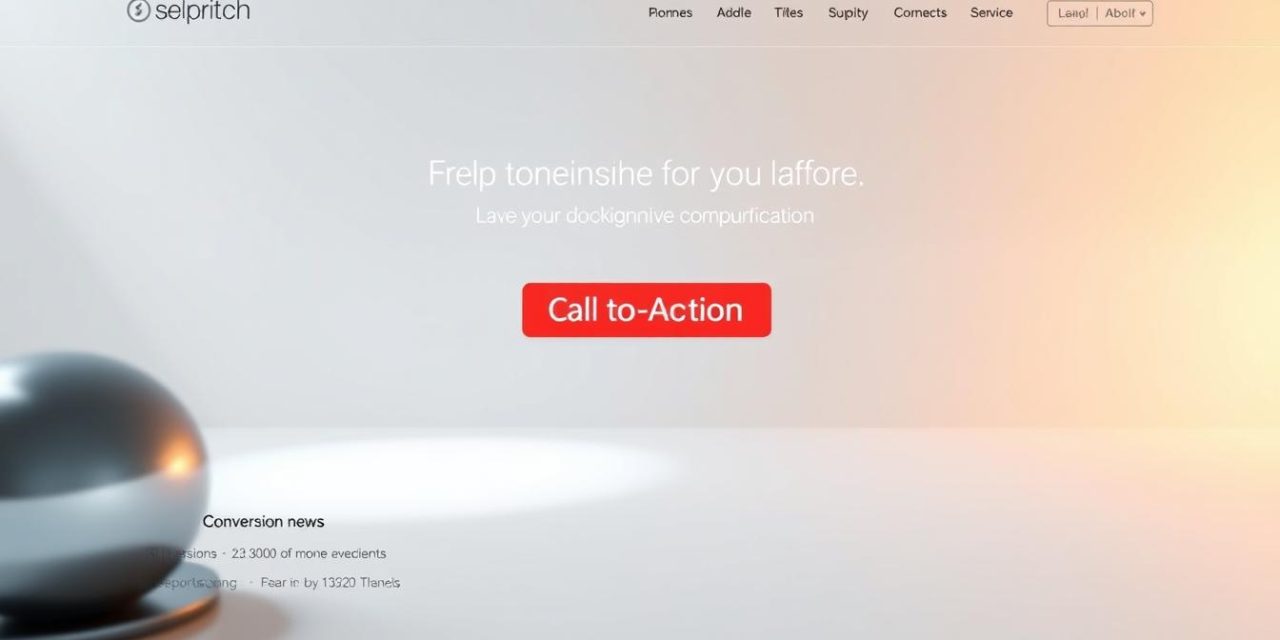
Imagine your website is a busy store. People are walking in, but they don’t know what to do next. A strong call-to-action is like a friendly guide. It shows visitors the exact next step you want them to take.
Many businesses miss this opportunity. In fact, a huge number of companies do not engage their visitors effectively. This means they are losing potential customers every single day.
This guide will show you how to change that. We will explore simple ways to make your website work harder. You will learn how to turn casual visitors into loyal customers.
We will cover everything from basic placement to advanced tactics. Our friendly approach makes it easy to understand and apply. Let’s build a winning strategy together.
Table of Contents
Key Takeaways
- A clear call-to-action guides visitors and boosts your results.
- Many websites miss big opportunities by not using CTAs correctly.
- Strategic placement is key to turning traffic into customers.
- A good strategy covers your entire site, not just the homepage.
- Simple, friendly instructions are more effective than complex ones.
Understanding the Basics: What is a Call-to-Action?
Digital marketing relies on clear pathways for visitor engagement. A well-planned strategy guides each internaute toward meaningful interactions with your brand.
Definition and Functionality
A call-to-action is typically a clickable bouton or link on your web page. It prompts visitors to take specific steps like downloading resources or signing up for services.
When someone clicks your CTA, they’re redirected to a dedicated landing page. This page focuses entirely on the offer mentioned in the button text.
The text on your bouton must clearly describe what happens next. This creates trust and improves conversion rates significantly.
The Role in Inbound Marketing
In inbound marketing, CTAs serve as strategic tools for audience segmentation. They help identify visitor interests based on their clicked actions.
These elements also enhance navigation by suggesting relevant contenu. This creates a more personalized experience for each internaute visiting your page.
Tracking CTA performance through metrics like click-through rates provides valuable insights. This data helps optimize your overall marketing strategy over time.
Setting Up a Powerful CTA Strategy
Strategic CTA implementation begins with understanding your audience’s needs. A real plan must be developed before placing any elements on your site. This allows prospects to take actions matching their expectations at the right moment.

Aligning CTAs with the User Journey
Your CTA approach should integrate into each stage of the marketing methodology. Visitors progress through your conversion funnel when you meet them where they are. A first-time visitor has different expectations than someone familiar with your services.
Through strategic placement, you can create personalized experiences for your audience. Marketing automation tools combined with CRM data enable intelligent CTAs. These adapt based on visitor behavior and previous interactions.
For example, if someone downloads a beginner’s guide, your system can later suggest advanced content. This progressive profiling builds stronger relationships over time. Each interaction helps qualify leads more effectively.
Smart CTAs consider pages visited, lead status, and customer lifecycle phase. This creates truly personalized engagement opportunities. Your audience receives relevant offers that match their current needs.
Designing Visually Striking CTAs
Effective design transforms simple prompts into powerful conversion tools that guide user behavior. The visual presentation of your elements can significantly impact how visitors interact with your content.

Importance of Color, Contrast, and Clarity
Color psychology plays a vital role in attracting attention. Your couleur choices should create strong contrast against the background. This helps each stand out clearly.
Every cta doit être easy to spot instantly. High contrast ratios ensure your prompts capture the attention they deserve. This visual prominence guides the visiteur naturally toward conversion.
Clarity in design means removing any confusion. Your contenu should be immediately understandable. A clear value proposition makes clicking irresistible.
Textual, Button, and Image-Based CTAs
Different situations call for various type approaches. Textual CTAs work well within content flow. They provide subtle conversion opportunities.
Button CTAs offer maximum visibility. The bouton design should balance impact with aesthetics. Proper sizing and spacing matter greatly.
Image-based CTAs combine visuals with action phrases. For exemple, a compelling graphic can attirer attention effectively. This type works well for featured offers.
Each exemple serves different visitor needs. The internaute experience varies based on CTA format. Testing helps determine what works best for your page.
Consider your page layout when choosing formats. The internaute should encounter CTAs naturally during their journey. Multiple formats can work together harmoniously.
Essential Call-to-Action Tactics for Conversion Optimization
Every clickable element on your site needs compelling copy to drive results. The right words can dramatically improve your conversion rates. Let’s explore how to craft messages that truly resonate.

Crafting Clear and Compelling Messages
Your message must be crystal clear. Visitors should instantly understand what you’re offering. Uncertainty kills engagement before it begins.
Use strong action verbs like « download » or « discover. » These words create momentum toward the desired action. They tell people exactly what to do next.
Create urgency with time-sensitive language. Words like « now » or « today » encourage immediate response. This psychological trigger boosts click-through rates significantly.
Always highlight concrete benefits. Focus on what visitors gain from clicking. The value proposition should be immediately apparent.
Here’s how different approaches compare:
| Approach | Example | Effectiveness |
|---|---|---|
| Action-Oriented | « Start Your Free Trial » | High |
| Benefit-Focused | « Get Expert Tips » | High |
| Generic | « Click Here » | Low |
Reassurance is crucial for commitment-heavy actions. Phrases like « no credit card required » reduce hesitation. This is especially important for subscription services.
The word « free » works like magic. When people know there’s no financial risk, they’re more likely to engage. This simple word can transform your marketing strategy.
Test different messages to find what resonates best. Small changes can have a big impact on your results.
Proven Examples and Best Practices
What separates effective engagement tools from mediocre ones? Let’s explore. Real-world exemples from successful companies provide valuable insights. These cas studies show how strategic prompts work in practice.
Insights from Global Brands and Case Studies
HubSpot offers a great exemple with dual prompts. They present both a free CRM and demo option. This approach serves different clients at various readiness levels.
Netflix uses a bold red bouton above the fold. Their « Get Started » text is simple and direct. This exemple call-to-action has proven highly effective.

HelloFresh demonstrates smart placement with two strategic prompts. One helps visiteurs find their ideal box. The other encourages immediate purchase decisions.
| Brand | Approach | Audience Targeting |
|---|---|---|
| HubSpot | Dual-option | Multiple segments |
| Netflix | Simple entry | Mass market |
| HelloFresh | Stage-based | Progressive |
Learning from Effective Implementations
Apple maintains elegance while ensuring discoverability. Their discreet blue prompts stand out subtly. This bonnes pratiques approach respects the internaute experience.
Zoom uses multiple prompts throughout their site. This exemple shows transparency with free and paid options. It builds trust with prospect visitors.
« The best prompts feel like natural next steps, not interruptions. »
Swile’s personal approach creates genuine connection. Their first-person language feels authentic. This bonnes pratiques technique reduces hesitation.
Quickbooks creates urgency with time-sensitive offers. Their countdown timers encourage immediate action. This exemple call-to-action tactic drives quick decisions.
Evernote’s « Remember everything » connects emotionally. It addresses universal needs rather than features. This guide to emotional connection works well.
Social proof near prompts, like Trustpilot scores, builds confidence. This exemples call-to-action strategy leverages community trust. It’s a powerful guide for building credibility.
Optimizing CTA Placement on Your Site
Strategic placement transforms passive browsing into active engagement. Your site internet layout determines whether visitors find your prompts quickly or miss them entirely. Proper positioning ensures every page guides visitors toward meaningful actions.
Only 47% of websites have CTAs visitors can find in under three seconds. This statistic highlights the importance of visible placement. Your prompts doit être immediately noticeable without creating frustration.
Fixed Position vs. Pop-Up Strategies
Fixed positioning embeds CTAs directly within your contenu. This approach works well in blog posts and service pages where prompts relate to surrounding information. Visitors encounter natural next steps as they read.
Pop-up strategies attirer attention through timed appearances. These elements can trigger when a visiteur spends 20 seconds on a page or shows exit intent. Contextual pop-ups feel more relevant than random interruptions.
Consider this comparison when choosing your approach:
| Strategy | Best For | Visitor Experience |
|---|---|---|
| Fixed Position | Content-rich pages | Natural flow |
| Pop-Up | High-intent pages | Targeted attention |
Mobile optimization requires special consideration. Touch-friendly buttons need larger sizing and strategic placement. Ensure your page web elements work seamlessly across all devices.
Remember that 72% of companies miss interior page opportunities. Spread CTAs throughout your site architecture to capture interest at every stage. Each page accueil and interior page should include relevant prompts.
Conclusion
The journey from casual browser to committed customer hinges on well-placed, compelling invitations to act. Throughout this guide, we’ve explored how strategic call-to-action implementation transforms visitor engagement into measurable results.
Remember that alignment with your audience‘s needs creates the most effective marketing approach. Design principles like color contrast and clear messaging significantly boost conversion rates. Urgency tactics and action-oriented language drive immediate responses.
Your website audit should identify opportunities to implement these bonnes pratiques. Start with high-traffic pages and gradually refine your entire web presence. Continuous testing ensures your approach evolves with changing visitor expectations.
By applying these principles, you’ll create a seamless path for prospects to become loyal clients. For deeper insights into converting visitors effectively, explore our comprehensive client acquisition strategies that complement this approach.
FAQ
What exactly is a call-to-action?
A call-to-action, or CTA, is a prompt on a website or in marketing content that tells your audience what to do next. It’s usually a button, link, or line of text that encourages an immediate response, like « Buy Now, » « Sign Up, » or « Download the Guide. » Its main job is to guide visitors toward becoming leads or customers.
How does a CTA fit into an inbound marketing strategy?
In inbound marketing, the goal is to attract and engage people naturally. A CTA acts as the friendly nudge that moves someone from just reading your blog to taking a meaningful step, like subscribing to your newsletter. It’s a key part of turning interest into action without being pushy.
Where is the best place to put a call-to-action on a webpage?
Great question! Placement really depends on your goal. For high visibility, many sites use a fixed bar at the top or bottom of the screen. Pop-ups can grab attention but should be used carefully to avoid annoying visitors. The best spot is often where it feels natural, like after a helpful article or near a product description.
What makes a CTA button visually effective?
An effective button stands out! Use a bold color that contrasts with your site’s design so it’s easy to spot. Keep the text short, action-oriented, and clear—think « Get Started » instead of « Click Here. » Size matters too; it should be large enough to notice but not overwhelming.
Can you give an example of a compelling CTA message?
Absolutely! Instead of a generic « Submit, » try something more enticing like « Get My Free Ebook » or « Start Your Free Trial. » Brands like Netflix use « Join Free for a Month » to create urgency and value. The phrase should make the benefit clear and spark curiosity.
How can I test if my CTAs are working well?
Testing is key to improvement! Try A/B testing different colors, wording, or placements to see what gets more clicks. Tools like Google Analytics can track your conversion rate. If a CTA isn’t performing, tweak the message or try a new location on the page.


